
Creating immersive game worlds isn’t just about stunning visuals, it’s about guiding players seamlessly through those worlds. One of the most critical yet often overlooked aspects of game art and design is visual hierarchy. Visual hierarchy ensures that players can intuitively understand what is important, where to focus, and how to navigate the game environment without frustration.
In this article, we’ll explore visual hierarchy in game environments, how it impacts user experience (UX), and practical tips for designers to create engaging, intuitive gameplay experiences.
What is Visual Hierarchy in Games?
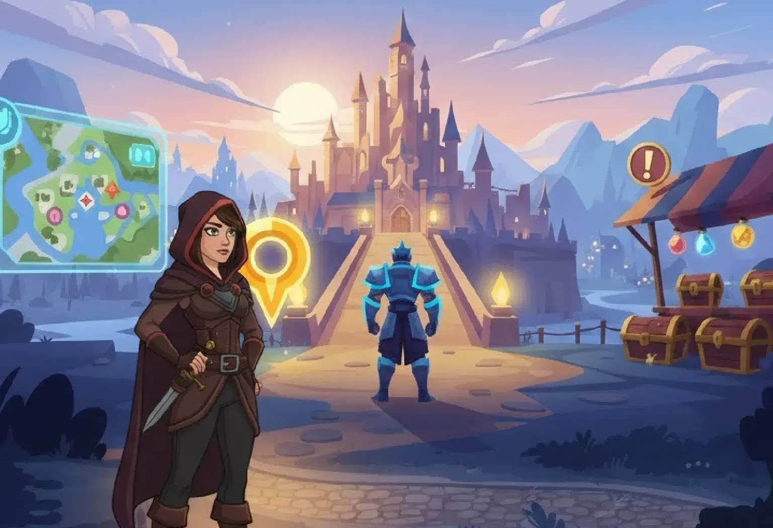
Visual hierarchy refers to the arrangement of elements in a game environment in a way that naturally guides the player’s attention. It answers questions like: which object should the player notice first? Which areas are interactive? Which elements are purely decorative?
In game art, visual hierarchy can be established using size, color, contrast, positioning, and motion. For instance, a glowing treasure chest in a dim dungeon immediately draws attention because it contrasts with its surroundings and signals importance. Without hierarchy, players might feel lost or overwhelmed, reducing their overall enjoyment.
Why Visual Hierarchy Matters for UX
A strong visual hierarchy is crucial for a positive user experience. Players don’t just want to admire beautiful game art; they want to understand their objectives and navigate efficiently.
Imagine entering a large open-world game where every building, character, and object looks equally important. Players might wander aimlessly, leading to frustration. By strategically directing attention, designers help players focus on objectives, explore intuitively, and enjoy the story without confusion.
Elements that Define Visual Hierarchy
Visual hierarchy in game environments is determined by several key design elements:
- Size: Larger objects naturally draw attention before smaller ones.
- Color: Bright, saturated colors stand out against muted backgrounds.
- Contrast: High contrast between an object and its environment signals importance.
- Placement: Objects near the center of the screen or along common movement paths attract notice.
- Motion: Moving elements are instantly more noticeable than static ones.
By combining these elements thoughtfully in game art, designers can subtly lead players through environments without overt instructions.
Using Color and Contrast Effectively
Color is one of the most powerful tools for establishing hierarchy. Designers can use warm colors like red and orange to highlight interactive or dangerous elements, while cool colors like blue and green can recede into the background.
Contrast also plays a pivotal role. High-contrast elements immediately stand out, making them ideal for key objects or paths. For instance, in a shadowy forest scene, a glowing portal catches the eye because it contrasts sharply with dark trees and muted foliage. This approach ensures players know where to focus first.
The Role of Lighting in Guiding Players
Lighting is more than just ambiance, it’s a directional tool. Designers can guide players through game art by manipulating light sources, shadows, and brightness.
For example, a spotlight or glowing lantern can subtly suggest the path forward, while darker areas might hint at danger or hidden secrets. Dynamic lighting can also create focal points, helping players understand what to explore next without explicit instructions.
Scale and Depth: Creating a Sense of Importance
Scale and depth help establish hierarchy by showing relative importance of elements. Larger objects or closer objects typically feel more significant than smaller, distant ones.
In 3D game environments, designers can use depth of field to blur less important areas while keeping primary objectives sharp. This not only enhances realism but also directs attention naturally, improving player comprehension and immersion in the game art.
Motion and Animation as Attention Drivers
Movement is inherently eye-catching. Designers often use subtle animations to guide attention, like fluttering leaves on a collectible item or blinking lights on a control panel.
However, it’s important to use motion sparingly. Too many moving elements can overwhelm players and disrupt hierarchy. Strategic motion ensures that players notice what’s important without unnecessary distractions.
Spatial Layout and Player Navigation
How objects are arranged in the game world impacts visual hierarchy and UX. Pathways, obstacles, and landmarks can lead players naturally toward objectives.
For instance, in an open-world game, a curved river or winding road can subtly guide players without obvious arrows. By combining layout with visual cues, like lighting, color, or movement, designers create a seamless, intuitive exploration experience. Effective spatial layout ensures players feel in control rather than lost.
Cultural and Psychological Considerations
Players from different cultures or with varying experiences may interpret visual cues differently. Designers should consider color symbolism, reading patterns, and visual attention tendencies.
For example, Western players often scan screens left-to-right, while others may prioritize top-to-bottom patterns. Recognizing these tendencies helps designers create game art and environments that are universally understandable, making hierarchy effective for a wider audience.
Practical Tips for Designers
To implement visual hierarchy effectively:
- Prioritize clarity over decoration: Not every element needs to compete for attention.
- Use iterative testing: Watch how players navigate environments to refine hierarchy.
- Combine cues: Use size, color, motion, and lighting together for stronger emphasis.
- Balance immersion and guidance: Avoid making guidance too obvious, which can break immersion.
- Consider accessibility: Use contrast and cues that work for colorblind or visually impaired players.
These strategies ensure that the game art is not only beautiful but functional, enhancing player experience and engagement.
Case Studies: Visual Hierarchy in Popular Games
Many successful games use visual hierarchy effectively:
- The Legend of Zelda: Breath of the Wild: Highlights interactable objects and pathways with subtle glow effects and lighting, guiding players organically.
- Hollow Knight: Uses color and contrast to differentiate threats from neutral objects, helping players prioritize attention.
- Portal 2: Combines motion and lighting to direct players through complex puzzle environments, reducing frustration.
Studying such examples provides valuable insights into implementing hierarchy in your own game art projects.
Conclusion
Visual hierarchy is a cornerstone of player-focused game design. By using size, color, contrast, lighting, motion, and spatial layout strategically, designers can create immersive worlds that are easy to navigate and enjoyable to explore.
When done correctly, hierarchy transforms game art from mere decoration into a functional tool that enhances user experience, guides exploration, and enriches storytelling. Remember, a game that looks beautiful but confuses its players risks losing engagement. Prioritize clarity, test often, and guide attention thoughtfully to ensure your environments are as intuitive as they are stunning.